Ceiver

Design

Our journey towards achieving the desired Red Phone look and feel.

Laying the groundwork
Our main goal

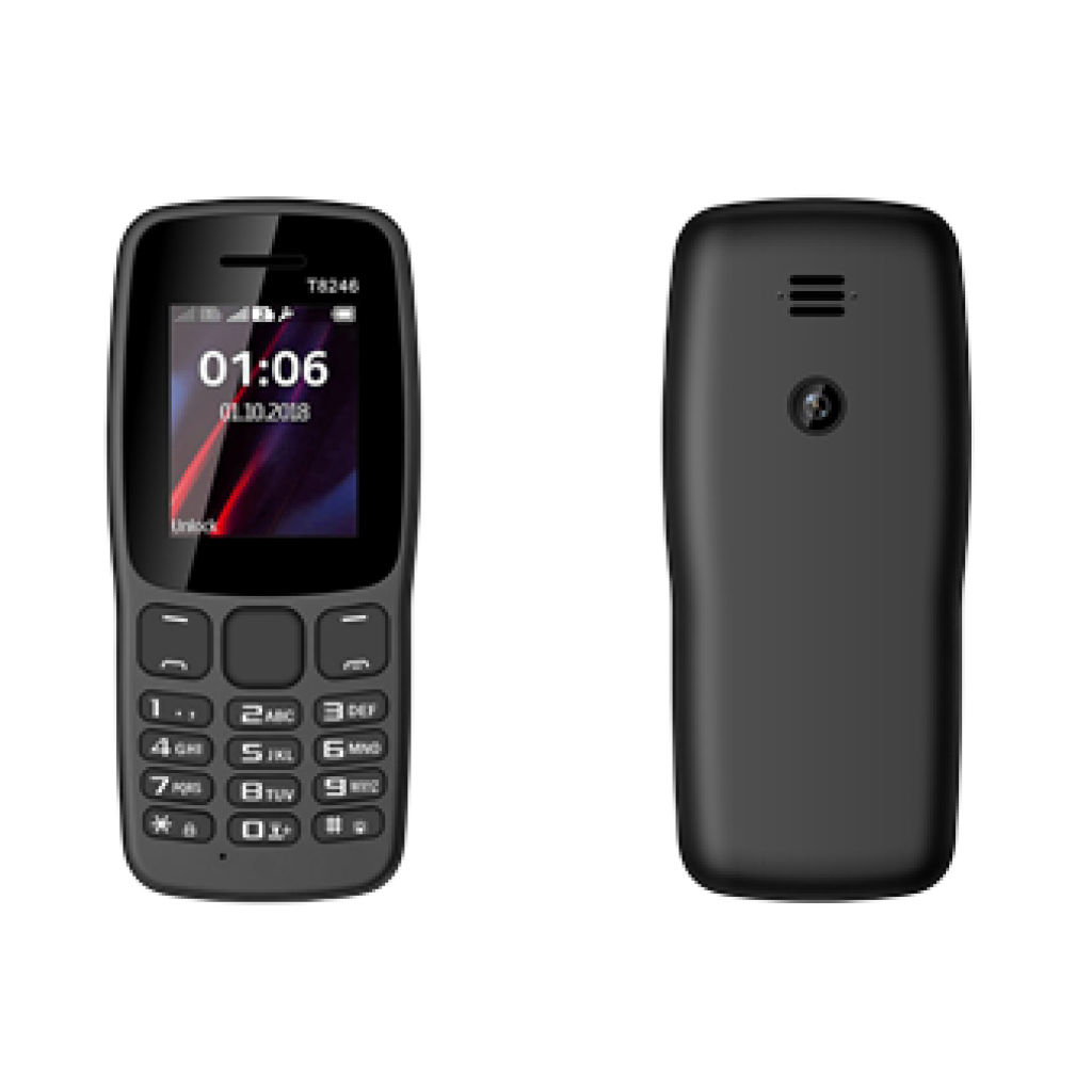
From the outset, we understood that designing Red Phone would be an extraordinary challenge. It was about defining the appearance of a phone crafted not only to serve as a dependable device but also to make a statement. A device that encourages its owner to rely less on technology and be more present in the moment. Our objective was to offer the world mobile phones that enable people to prioritize what matters most to them. It was evident to us that the design had to embody this message.
Inspired by a stone

In a very organic manner, our primary inspiration for the shape of  Red Phone became a stone. We were drawn to its smoothness, solidity, and symbolism: a harmonious blend of human craftsmanship and nature. Neutral in appearance, it reflects a neutrality in people’s lives.

Defining direction

We initiated the design process by immersing ourselves in our primary inspiration. Our office became adorned with a diverse collection of stones, gathered from various locations worldwide by us and our friends. Gosia, our Head of Design, meticulously studied the shapes and properties of these natural treasures. Each stone was chosen with care, representing a unique contribution to our creative journey.Everyone wanted to contribute a stone to the creative process!

Seeking guidance from design professionals
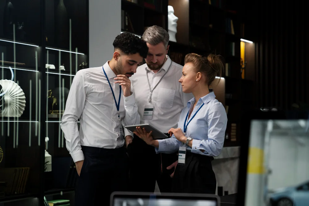
Prior to collaborating with an in-house industrial designer, we sought advice from several design studios across India . While we received numerous brilliant and aesthetically pleasing ideas, some were impractical for manufacturing purposes. Despite our search, we hadn’t found the perfect fit. However, upon meeting Zara, our exceptional designer, we were confident she could help us achieve our vision. By analyzing our desired outcome, proposals, feedback, Zara began to shape our perfect design.

Immersing ourselves in inspiration

The next step involved gathering additional inspirational ideas, brands, products, studio photos, and objects that resonated with the result we aimed to achieve. We explored Japanese brands like MUJI for their approach and aesthetics, design studios such as Nendo or Leibal, and European influences from Scandinavian brands like HAY or Permafrost. We even studied materials and finishes used in cars like Volvo or BMW.

Thinking about the users

We couldn’t begin our work without giving careful consideration to the most important people – the users of Red Phone. Who are they? What are their preferences, opinions, beliefs, and needs? Red Phone isn’t for everyone. We engaged with a diverse range of individuals, from those who were enthusiastic about our project to others who were more skeptical. These conversations yielded valuable ideas, insights, and criticisms, enabling us to view Red Phone from various perspectives.